Integrating single-cell transcriptomes from multiple samples

As single-cell data complexity grows, integrating multiple datasets has become standard. However, batch effects—arising from technical and biological variations—must be corrected for accurate analysis. These effects stem from differences in sample handling, protocols, sequencing platforms, and biological factors like donor background or tissue origin. Computational methods help eliminate unwanted variation, ensuring biologically meaningful signals. Batch correction requires two key decisions: selecting the appropriate method and its parameters, and defining the batch covariate based on the integration objective. In this notebook, we explore core concepts and methods for data integration and batch correction, with hands-on activities using Seurat and Harmony. Additionally, we perform benchmarking to compare integration strategies, helping select the most effective method while preserving biological relevance.


Install the required libraries


download.file("https://github.com/eddelbuettel/r2u/raw/master/inst/scripts/add_cranapt_jammy.sh",
              "add_cranapt_jammy.sh")
Sys.chmod("add_cranapt_jammy.sh", "0755")
system("./add_cranapt_jammy.sh")
bspm::enable()
options(bspm.version.check=FALSE)
                

We will create an R function to performs system calls


shell_call <- function(command, ...) {
  result <- system(command, intern = TRUE, ...)
  cat(paste0(result, collapse = "\n"))
}
                

Install required libraries


# Install the R.utils package
install.packages("R.utils")

# Install a specific commit/version of the Seurat Wrappers package from GitHub
remotes::install_github('satijalab/seurat-wrappers@d28512f804d5fe05e6d68900ca9221020d52cf1d', upgrade = FALSE)

# Install the Seurat Data package from GitHub
remotes::install_github('satijalab/seurat-data')

# Check if the BiocManager package is installed; if not, install it quietly
if (!require("BiocManager", quietly = TRUE))
    install.packages("BiocManager", quiet = TRUE)

# Install the Harmony package for integrating single-cell datasets
install.packages("harmony")
                

Introduction

Integration is a technique used to combine single cell data from different experiments or conditions into a single analysis space. This is especially useful where data from different batches or conditions can be integrated to identify common biological patterns. In this example of integrating multiple datasets representing, for example, different biological conditions, sample handling, or experimental protocols, we will explore the integration performed by Seurat and Harmony separately.


# Load libraries
library(Seurat)
library(SeuratData)
library(SeuratWrappers)
library(cowplot)
library(harmony)
# If the time is over than 2000 seconds, the work will break
options(timeout=2000)
                

Loading data

Here, we load the datasets necessary to perform an integration analysis.

This tutorial demonstrates the integration process using peripheral blood mononuclear cells (PBMCs) data from the study by Kang et al, 2017. The experiment involved splitting PBMCs into two groups: one control group and one stimulated group treated with interferon beta. The treatment induced cell type-specific gene expression changes, creating a challenge for joint analysis. Without integration, cells may cluster based on their stimulation condition rather than their intrinsic cell type identity, complicating the interpretation of results.


To clarify, the integration aims to align data from both groups into a common space where cells cluster by type rather than treatment condition. This process is essential for accurately identifying shared and unique features across the datasets while minimizing the influence of batch effects introduced by the experimental design.


Steps to follow:

  • Load the PBMC datasets: Use preprocessed gene expression data from the Kang study.
  • Inspect the dataset composition: Verify that both control and stimulated groups are included and check for adequate cell type representation.
  • Perform integration: Employ integration tools such as Seurat or Harmony to combine the datasets while accounting for batch effects.
  • Visualize the results: Examine clustering to ensure cells group primarily by type rather than by treatment condition. These steps ensure a robust and biologically meaningful comparison of the control and stimulated PBMC groups.
  • 
    # install dataset
    InstallData("ifnb")
                    
    
    # load dataset
    LoadData("ifnb")
                    
    
    # Transfer ifnb data to sc_dataset
    sc_datasets <- ifnb)
                    
    
    # %>%: This is the operator from the dplyr package. It allows you to chain operations in a readable way, passing the result of one operation as input to the next.
    # glimpse is a function of the dplyr package that provides a quick and concise view of the dataset, showing the first values ​​of each column and the respective classes.
    
    sc_datasets %>% dplyr::glimpse()
                    

    Data preprocessing

    We preprocess the data to a point that is in common for both Seurat and Harmony data integration.

    
    # Update the Seurat object to the latest format, fixing compatibility issues with older Seurat objects
    sc_datasets <- UpdateSeuratObject(object = sc_datasets) 
    # If this step is skipped, an error occurs: 'no slot of name "images" for this object of class "Seurat"'
    
    # Normalize the gene expression data in the Seurat object
    sc_datasets <- Seurat::NormalizeData(sc_datasets, verbose = FALSE)
                    

    The NormalizeData function in Seurat simplifies raw single-cell RNA sequencing (scRNA-seq) data into a standardized form, making it easier to compare cells and detect meaningful biological patterns. This process involves three main steps:

    1. Scaling Counts: For each gene, the count in a given cell is divided by the total number of counts from all genes in that cell. This adjusts for differences in sequencing depth across cells, ensuring fair comparisons.
    2. Adjusting Scale: The result from the first step is multiplied by a scaling factor (commonly set to 10,000). This makes the normalized values more interpretable, roughly resembling counts per 10,000 reads.
    3. Log Transformation: Finally, the scaled counts are transformed using a logarithmic function. This step reduces the effect of extremely high or low values, making patterns in the data easier to detect.

    This method is essential because it ensures that any differences observed between cells reflect true biological variations, not technical differences from the sequencing process

    
    # View the structure of the Seurat object, including metadata and feature data
    dplyr::glimpse(sc_datasets)
                    

    Run Seurat data integration

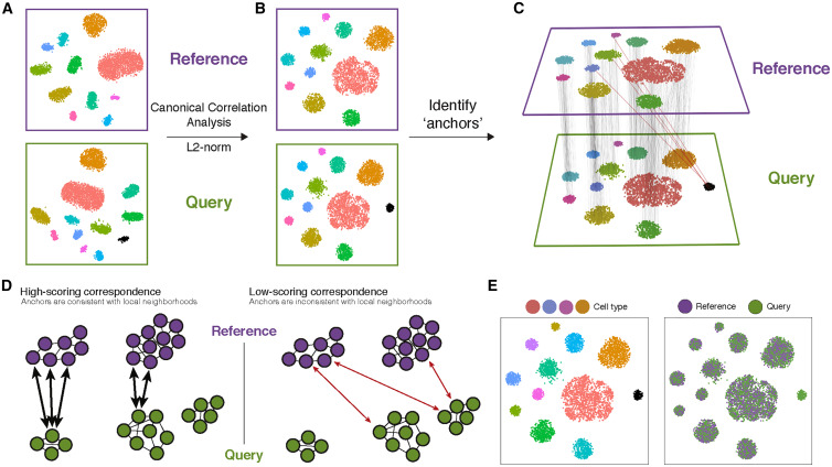
    The integration performed here with Seurat consists of using a Canonical Correlation Analysis to identify anchors between datasets, as indicated in the original paper:

    img

    Split dataset into a list of datasets

    
    # Identify the top 2000 variable features for each dataset in the list
    sc_datasets.list <- lapply(X = sc_datasets.list, FUN = function(x) {
                        x <- FindVariableFeatures(x, selection.method = "vst", nfeatures = 2000)
                        })
                    

    Find highly variable features for each condition separately

    
    # Identify integration features to be used for aligning datasets
    features <- SelectIntegrationFeatures(object.list = sc_datasets.list)
                    

    Find the features that are repeatedly variable across datasets for integration (anchor features).

    
    # Find integration anchors between the datasets using the selected features
    sc_datasets.anchors <- FindIntegrationAnchors(object.list = sc_datasets.list, anchor.features = features)
    
    # Below is the resume of the running process that will appear in your screen
                    

    Integrate datasets - Creates an integrated data assay

    
    # Integrate the datasets into a single Seurat object using the integration anchors
    sc_datasets.combined <- IntegrateData(anchorset = sc_datasets.anchors)
    
    # Below is the resume of the running process that will appear in your screen
                    
    
    # View the structure of the integrated Seurat object
    dplyr::glimpse(sc_datasets.combined)
                    

    Run the standard workflow for visualization and clustering.

    
    # Scale the integrated data, run PCA, perform UMAP for dimensionality reduction, find neighbors, and cluster cells
    sc_datasets.combined <- ScaleData(sc_datasets.combined, verbose = FALSE) %>%
                            RunPCA(npcs = 30, verbose = FALSE) %>%
                            RunUMAP(reduction = "pca", dims = 1:30) %>%
                            FindNeighbors(reduction = "pca", dims = 1:30) %>%
                            FindClusters(resolution = 0.5)
                    
    
    # Set the size of the plots for visualization
    options(repr.plot.height = 5, repr.plot.width = 16)
    
    # Visualization: Create UMAP plots with different grouping or labeling options
    p1 <- DimPlot(sc_datasets.combined, reduction = "umap", group.by = "stim")  # Group cells by "stim" metadata
    p2 <- DimPlot(sc_datasets.combined, reduction = "umap", label = TRUE, repel = TRUE)  # Label clusters on the UMAP
    p3 <- DimPlot(sc_datasets.combined, reduction = "umap", group.by = "seurat_annotations")  # Group by annotations
    p1 + p2 + p3  # Combine the plots
                    

    Run Harmony

    From the original paper of harmony: PCA embeds cells into a space with reduced dimensionality. Harmony accepts the cell coordinates in this reduced space and runs an iterative algorithm to adjust for dataset specific effects:


  • Harmony uses fuzzy clustering to assign each cell to multiple clusters, while a penalty term ensures that the diversity of datasets within each cluster is maximized.
  • Harmony calculates a global centroid for each cluster, as well as dataset-specific centroids for each cluster.
  • Within each cluster, Harmony calculates a correction factor for each dataset based on the centroids.
  • Finally, Harmony corrects each cell with a cell-specific factor: a linear combination of dataset correction factors weighted by the cell’s soft cluster assignments made in step a. Harmony repeats steps a to d until convergence. The dependence between cluster assignment and dataset diminishes with each round. Datasets are represented with colors, cell types with different shapes.
  • img
    
    # Set the plot dimensions for visualization
    options(repr.plot.height = 4, repr.plot.width = 6)
    
    # Find variable features, scale data, run PCA, and integrate using Harmony
    sc_datasets.harmony <- FindVariableFeatures(sc_datasets, selection.method = "vst", nfeatures = 2000) %>%
                           ScaleData(verbose = FALSE) %>%
                           RunPCA(npcs = 30, verbose = FALSE) %>%
                           RunHarmony("stim", plot_convergence = TRUE)  # Integrate using "stim" as a batch variable
                    

    To directly access the harmonized embeddings:

    
    # Extract Harmony embeddings (low-dimensional representations) and display the first 5 rows and columns
    harmony_embeddings <- Embeddings(sc_datasets.harmony, 'harmony')
    harmony_embeddings[1:5, 1:5]
                    
    
    # Run UMAP using Harmony embeddings, find neighbors, and cluster cells
    sc_datasets.harmony <- RunUMAP(sc_datasets.harmony, reduction = "harmony", dims = 1:30) %>%
                           FindNeighbors(reduction = "harmony", dims = 1:30) %>%
                           FindClusters(resolution = 0.5)
                    
    
    # Set plot dimensions for visualization
    options(repr.plot.height = 5, repr.plot.width = 16)
    
    # Visualization: Create UMAP plots with different grouping or labeling options
    p1 <- DimPlot(sc_datasets.harmony, reduction = "umap", group.by = "stim")  # Group by "stim"
    p2 <- DimPlot(sc_datasets.harmony, reduction = "umap", label = TRUE, repel = TRUE)  # Label clusters
    p3 <- DimPlot(sc_datasets.harmony, reduction = "umap", group.by = "seurat_annotations")  # Group by annotations
    p1 + p2 + p3  # Combine the plots
                    

    Integration metrics

    Inspect mixing within cluster


    We will use a function to plot the batch composition of each cluster.


    This function was borrowed from: https://github.com/cellgeni/scRNA.seq.course/blob/master/course_files/utils/custom_seurat_functions.R

    
    # Define a custom function to visualize the distribution of clusters across datasets
    plot_integrated_clusters = function(srat, batchcolumn) {
      ## Take an integrated Seurat object and plot distributions across the "batchcolumn"
      library(Seurat)
      library(patchwork)
      library(ggplot2)
      library(reshape2)
      library(RColorBrewer)
    
      # Create a table of cell counts by cluster and dataset
      count_table <- table(srat@meta.data$seurat_clusters, srat@meta.data[[batchcolumn]])
      count_mtx   <- as.data.frame.matrix(count_table)  # Convert table to a data frame
      count_mtx$cluster <- rownames(count_mtx)  # Add cluster identifiers as a column
      melt_mtx    <- melt(count_mtx)  # Reshape data for ggplot
      melt_mtx$cluster <- as.factor(melt_mtx$cluster)  # Convert cluster column to a factor
    
      # Calculate cluster sizes
      cluster_size   <- aggregate(value ~ cluster, data = melt_mtx, FUN = sum)
    
      # Sort clusters by size
      sorted_labels <- paste(sort(as.integer(levels(cluster_size$cluster)), decreasing = TRUE))
      cluster_size$cluster <- factor(cluster_size$cluster, levels = sorted_labels)
      melt_mtx$cluster <- factor(melt_mtx$cluster, levels = sorted_labels)
    
      colnames(melt_mtx)[2] <- "dataset"  # Rename column for clarity
    
      # Plot the distribution of cells per cluster (log scale)
      p1 <- ggplot(cluster_size, aes(y = cluster, x = value)) +
            geom_bar(position = "dodge", stat = "identity", fill = "grey60") +
            theme_bw() + scale_x_log10() + xlab("Cells per cluster, log10 scale") + ylab("")
    
      # Plot the fraction of cells in each dataset for each cluster
      p2 <- ggplot(melt_mtx, aes(x = cluster, y = value, fill = dataset)) +
            geom_bar(position = "fill", stat = "identity") +
            theme_bw() + coord_flip() +
            scale_fill_brewer(palette = "Set2") +
            ylab("Fraction of cells in each dataset") + xlab("Cluster number") + theme(legend.position = "top")
    
      p2 + p1 + plot_layout(widths = c(3, 1))  # Combine plots
    }
                    
    
    # Visualize clusters for integrated datasets
    plot_integrated_clusters(sc_datasets.combined, 'stim')
                    
    
    # Visualize clusters for harmony
    plot_integrated_clusters(sc_datasets.harmony, 'stim')
                    

    This measures how well mixed a composite dataset is. According to this link, lower scores represent better mixing. See also this code


    This metric evaluates whether the neighborhood of a cell is well mixed. In other words, whether it contains a small number of cells from each dataset (e.g., k=5).

    
    # Calculate the mixing metric for Seurat integrated data
    seurat_mixing <- MixingMetric(sc_datasets.combined,
                                  'seurat_clusters',  # Column to evaluate mixing
                                  reduction = "pca",  # Use PCA embeddings
                                  dims = 1:2,         # Evaluate the first two dimensions
                                  k = 5,              # Number of nearest neighbors
                                  max.k = 300,        # Maximum number of neighbors
                                  eps = 0,            # Tolerance for neighbor search
                                  verbose = TRUE      # Print progress
                                 )
                    
    
    # Calculate the mean of the Seurat mixing metric
    mean(seurat_mixing)
                    
    
    # Calculate the mean of the Seurat mixing metric
    mean(seurat_mixing)
                    
    
    # Calculate the mixing metric for Harmony integrated data
    harmony_mixing <- MixingMetric(sc_datasets.harmony,
                                   'seurat_clusters',
                                   reduction = "harmony",
                                   dims = 1:2,
                                   k = 5,
                                   max.k = 300,
                                   eps = 0,
                                   verbose = TRUE
                                 )
                    
    
    # Calculate the mean of the Harmony mixing metric
    mean(harmony_mixing)
                    
    
    # Calculate the mean of the Harmony mixing metric
    mean(harmony_mixing)
                    

    Let's compare when using no integration, Seurat, and Harmony:

    
    # Identify the top 2000 most variable features (genes) using the "vst" method.
    # These features are used for downstream analysis.
    sc_datasets <- FindVariableFeatures(sc_datasets, selection.method = "vst", nfeatures = 2000) %>%
                    
                    # Scale and center the data for the identified variable features.
                    # This standardizes the expression values across cells.
                    ScaleData(verbose = FALSE) %>%
                    
                    # Perform Principal Component Analysis (PCA) to reduce dimensionality.
                    # Retain the first 30 principal components for downstream analysis.
                    RunPCA(npcs = 30, verbose = FALSE) %>%
                    
                    # Apply Uniform Manifold Approximation and Projection (UMAP) for non-linear dimensionality reduction.
                    # Use the PCA results as input and the first 30 principal components.
                    RunUMAP(reduction = "pca", dims = 1:30) %>%
                    
                    # Compute a shared nearest neighbor (SNN) graph for clustering.
                    # This step identifies relationships between cells based on their UMAP embeddings.
                    FindNeighbors(reduction = "pca", dims = 1:30) %>%
                    
                    # Perform clustering of cells using the SNN graph.
                    # Resolution controls the granularity of the clusters (higher resolution = more clusters).
                    FindClusters(resolution = 0.5)
                    
    
    # Set the size of the output visualization.
    options(repr.plot.height = 5, repr.plot.width = 16)
    
    # Create a UMAP plot grouping cells by the "stim" metadata column.
    p1 <- DimPlot(sc_datasets, reduction = "umap", group.by = "stim")
    
    # Create a UMAP plot for the integrated dataset, grouping cells by the "stim" metadata column.
    p2 <- DimPlot(sc_datasets.combined, reduction = "umap", group.by = "stim")
    
    # Create a UMAP plot for the Harmony-corrected dataset, grouping cells by the "stim" metadata column.
    p3 <- DimPlot(sc_datasets.harmony, reduction = "umap", group.by = "stim")
    
    # Combine the three UMAP plots (p1, p2, and p3) into a single visualization.
    p1 + p2 + p3
                    
    
    # Set the height and width of the output visualization.
    options(repr.plot.height = 5, repr.plot.width = 16)
    
    # Create a UMAP plot for the original sc_datasets object.
    # The 'label' parameter adds labels to the clusters in the plot.
    # The 'repel' parameter prevents text labels from overlapping.
    p1 <- DimPlot(sc_datasets, reduction = "umap", label = TRUE, repel = TRUE)
    
    # Create a UMAP plot for the combined sc_datasets object.
    p2 <- DimPlot(sc_datasets.combined, reduction = "umap", label = TRUE, repel = TRUE)
    
    # Create a UMAP plot for the harmony-corrected sc_datasets object.
    # This plot also uses UMAP, with labels and repelling to avoid overlaps.
    p3 <- DimPlot(sc_datasets.harmony, reduction = "umap", label = TRUE, repel = TRUE)
    
    p1 + p2 + p3 #Combine plots
                    

    Extra Questions:

  • How different are the results between the Seurat and Harmony integration?
  • Why can this happen?
  • Can you identify which markers changed in the clusters generated in one method vs the other?